Painting Heritage Colours In A New Light.
“No man ever steps in the same river twice, for it is not the same river, and he is not the same man.”
~ Heraclitus.
When attempting to choose exterior paint colours for their home people often fall back on heritage colour palettes, it’s easy to understand why, the colour choices have been whittled down to a manageable selection. Benjamin Moore’s Historic Colors palette has 191 colours, and the ever favourite among historic colour lovers; Farrow and Ball, always maintains 132 colours and has brilliantly used story-telling around each colour, marketing gold at its finest.
Overwhelm is one of the most challenging things for people when choosing paint colour and whether it’s 191 or 132 either of those numbers are far more manageable than 1200 plus.
There’s also another category of homeowner, the ones who actually own a house that is turn of the last century vintage and when painting time comes they often feel a pressure to “be authentic”. I have nothing against being authentic, as far as I’m concerned it’s a very important attribute for each of us an individuals, however, when it comes to paint colours my approach is that interpretation and feeling far outweigh authenticity.
I have come to understand that I love old homes, and am especially fond of houses built in the era of late 1890’s to early 1900’s. I love old homes because they have character, because they’re usually filled with funny quirks and are almost always imperfect. I’m fond of the quirks and imperfections because they afford me the opportunity to really put my creativity to the test. Old houses always have a colour challenge that needs to be looked at from a creative perspective, one where the “rules” are going to fall flat for you every time.
When choosing new colours for a heritage or character home my best advice is to not force yourself into designated heritage/historic colours and only those colours. Colour is an emotional experience and therefore the “feeling” is far more important than what is strictly period “correct”.
Hilariously the people at Sonoma Magazine suggest referencing the below colour palette for a house from the 1910’s - 1920’s. Can we really believe there’s accuracy to this digital version? Can we really believe there’s accuracy to the hard copy that is 100 years old? Yet, this is the advice from an article on How To Use Color To Make Your Vintage Home Reflect Its History. Yeah, I think we’ll just move on from that! It’s a charming bit of novelty but believe me, you don’t want to be the neighbour of the person who uses Aladdin as their inspiration.
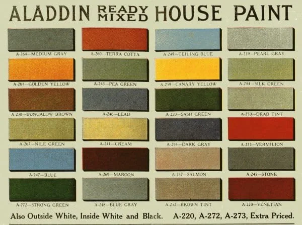
Aladdin Ready Mix House Paint
Previously, colours would have been mixed on-site, usually under the supervision of the lady of the house. Notice, Ceiling Blue.
We also need to be highly sceptical of the accuracy of historic colours. Years ago I was hired to choose a colour palette for a local heritage house museum owned by the city of New Westminster which is well known for its heritage houses. As this particular house is owned by the city and operates as a museum I was required to justify my colour choices. I did a great deal of research about paint scrapings and came across a wonderful man in the U.K. who has worked on many high profile heritage buildings there. Ultimately his research led him to believe that paint scrapings are to be taken with a rather enormous grain of salt. Therefore my approach to that house was the same as it always is; to be respectful of the architecture and to create a beautiful, happy and harmonious marriage between architecture and colour.
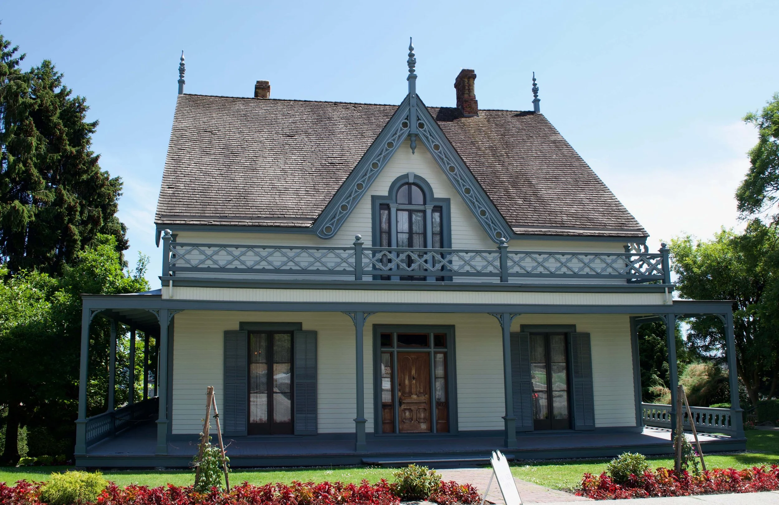
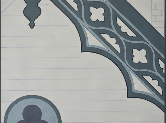
Irving House Museum. New Westminster, BC and my mock-up of its fantastic bargeboards.
Here in Vancouver, BC we have a True Colours Palette that was created by the Vancouver Heritage Foundation. It consists of 40 “true” Vancouver colours and because grant money is often made available to heritage house homeowners if this palette is used, well, you can guess what happens. I’m not against these colours and I think it’s great that effort went into it and that it exists, but I can always tell when that palette has been used on a house and each time I have exactly the same experience; the house always feel very heavy to me, that’s the only way I can describe it. Even when the homeowner has attempted to include some sort of colour whimsy, to me the houses feel like they’ve been weighed down with lead - which is actually what would originally have been used in many of the paint colours, but also would have made the colours more interesting.
We are not frozen in the past, we have changed and evolved. Light has changed, our eyes have changed.
We do not see a house as the owner of a newly built 1907 house saw it. We’re now using paint that is essentially plastic, rather than oil based, those mediums make a difference to colour. They make a difference to your experience of the surface, they make a difference to the way light intermingles with the colour. They make a difference to the way the colour “sits” on the surface or absorbs into it.
In 2025 I was hired for a second time to create a colour palette for a registered heritage house in New Westminster, the first time I worked on the exterior was 2014, that project went on to receive an award from the Royal City Builders for its heritage restoration.
Here’s the house from 2014
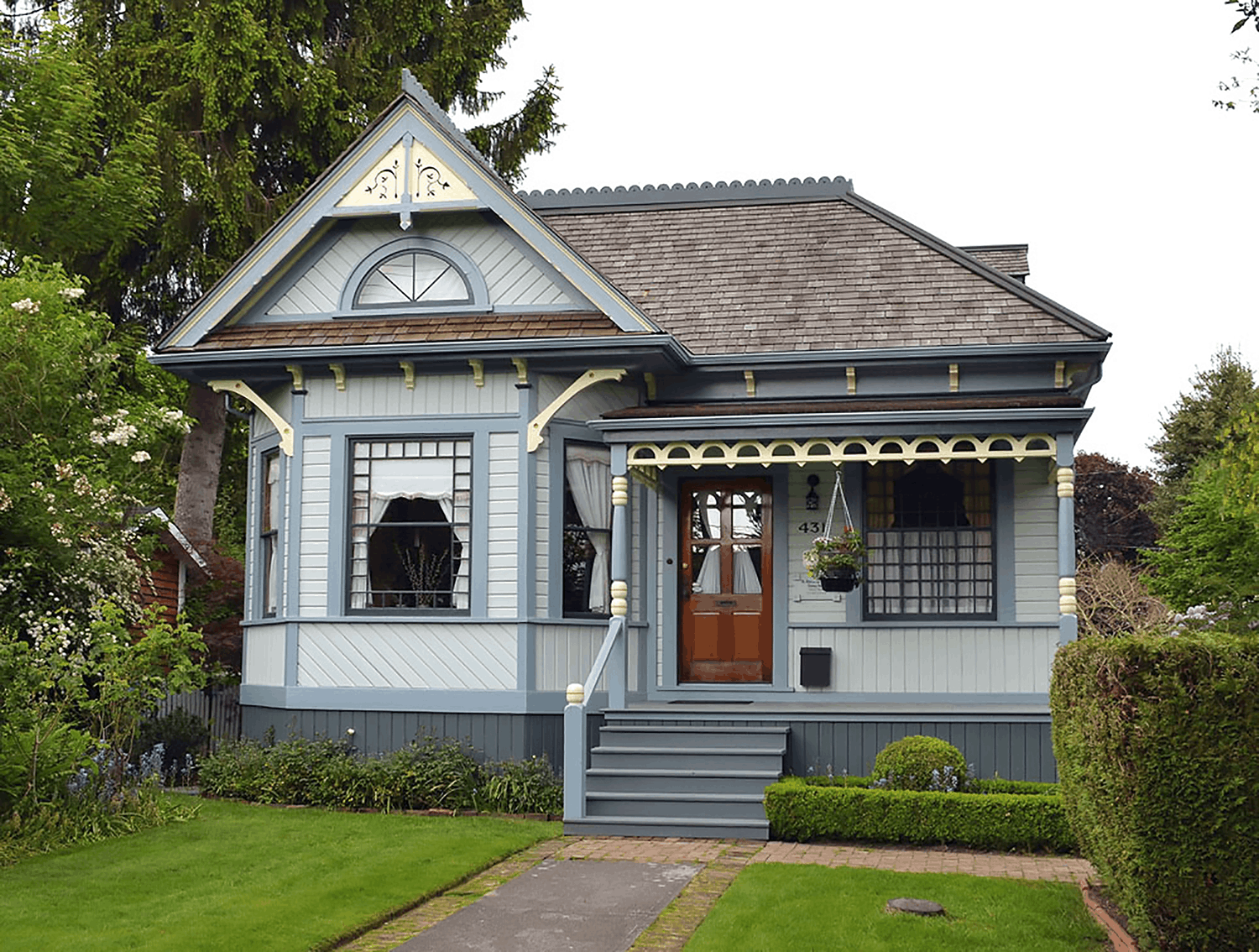
Even though the paint was still in good shape and the owners could have waited a few more years, for reasons of their own they decided to re-paint the exterior in 2025 and wanted to make a couple of small changes.
In 2014 the entire palette was made up of Benjamin Moore Historic Colors, however with the new colour on the window sash I knew I had to change the trim colour. There was nothing in the Historic Colors palette that worked for me, so I stepped outside of it. It still feels like a heritage house, the use of a “modern” colour has not compromised the look.
Here’s the house now, can you spot the changes? I’ve already given you one.

As an aside, for all you people who hate painting wood, notice how much more lively and inviting the front door is now.
Colour is a powerful medium that has the ability to affect the architecture of a house, but colour must also be viewed in context. Paint colour alone is not necessarily going to make your house feel heritage, or modern or like a farmhouse or like that place you stayed in southern Italy and because we can never step into the same river twice, there’s really no need to slavishly follow a designated colour palette - unless of course, that’s your deep desire.
One of the things I love about colour is that there are actually very few rules, most colour rules have been made up by people trying to sound smart.
Colour is a big, beautiful world that can’t be constrained into a certain time period. It’s a relationship bound chameleon. What matters most is not the time-frame of the colour palette but the harmony and balance between the colours, discernment in colour placement and the happy marriage between architecture and colour.
Thanks for reading.
Stay Colourful!