Our Lost Connection To Colour

Hindu god, Vishnu
I’ve spent close to thirty years as an architectural color consultant and what I’ve seen in those years is how much people struggle with color when attempting to choose it for their homes, like so many things, we have lost our connection to the deep meaning of color. Why did this happen?
Color was deeply embedded into ancient civilizations and cultures. Hinduism has the blue god; Vishnu, imagine that, a god with blue skin! The internet will give you all kinds of reasons for this but I’m not Hindu and will not pretend that I know why he’s blue, I’m just going to draw attention to the embrace of color.
We may not be able to see much of it now, but pretty much all ancient cultures loved color. They used what they could, how they could. The earth was literally their paint box and they would have worked hard for it, it would not have been easy to come by. Is it the effort that made it so worthwhile – no doubt.
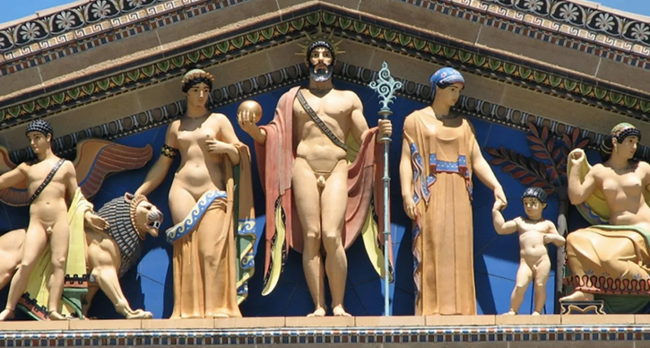
How the Parthenon really looked
With effort we ascribe meaning. Color itself becomes numinous and symbolism is assigned. Living in a time when society was deeply connected to nature you come to understand that nature has given you this amazing gift of pigments. It came from the earth, therefore it was treasured.
It's challenging for our eyes to look at the figure below and not feel that it’s just gaudy and awful, but to the ancient Babylonians this color combination would have portrayed and cemented the meaning of this as a very powerful female goddess figure, one not to be messed with.
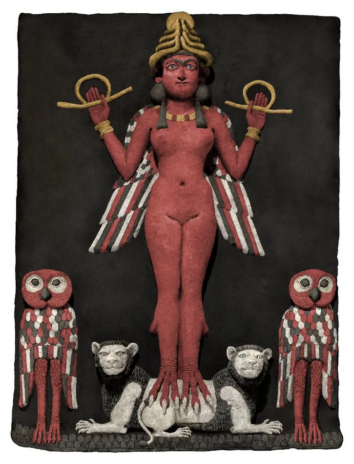
The washed-out version we see today, while still powerful, is much more “approachable”.

The more challenging it was to acquire and make, the more a color was valued. This would have been true, to varying degrees, up to about the mid 1800’s, when it seems something happened in our world that changed it, the expansion on that idea I’ll keep for another time, right now I’ll stick to the topic of house paint.
Prior to the birth of large paint companies, painters and decorators would mix paint on-site under the guidance of and in collaboration with, typically, the lady of the house. With the advent of pre-mixed, store bought paint colors the beginning of the end had arrived. Now that paint had turned into a “business” more colors had to be added – make em want more!! Today Benjamin Moore states that they have over 3500 colors and Sherwin Williams over 1700. Nothing short of overwhelming.

Notice “Ceiling Blue”
Let’s face it, this amount of color selection for the residential market, indeed for just about any market, is more than likely unnecessary. No doubt this is why companies such as Farrow & Ball really took off, a color palette of 132 is manageable. With 132 colors we can easily get an overview of the entire palette and not feel overwhelmed. With this smaller palette Farrow & Ball is also a more expensive paint. Value in scarcity.
Paint has become cheap and easy and once that happens respect is lost. We value what we have to put effort into. We value what is rare. The devaluation of color is not the fault of color. It is the fault of businesses driven by profit and the misguided idea that there must always be something “new”. I’m not against new, but I am against new just for the sake of it.
I would say the number of times that a client has seriously asked me about what the latest colors are would be less than 5%. Nobody cares! What people want is what resonates within them, they want a reflection of themselves.
When we lost our connection to color we lost some sense of trust in ourselves. I have an expertise in color and that is put to use with my clients, but there are other times when really what I’m doing is giving them permission, permission to use color and permission to be themselves rather than what some interior design magazine or some form of social media tells them to be. It’s a first step.