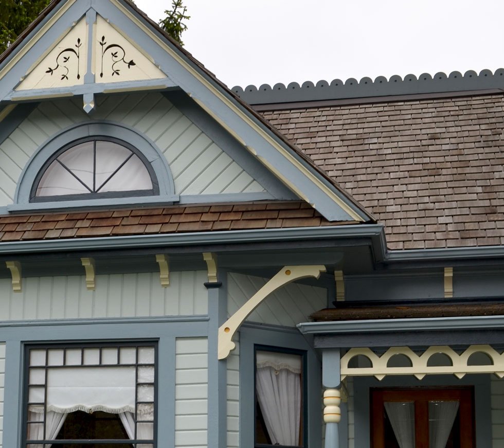
Heritage house paint colours; it’s not just about colour, it’s also about placement.
How colour placement brought an 1890 Queen Anne Revival home to life.
The Falding House was built in 1890 in the Queen Anne revival style. Robert Falding was the original owner and may have been a clerk at the Supreme Court. In 1929 the house was owned by George Gray who was a steam roller driver for the city of New Westminster.
The photo below is courtesy of New Westminster Heritage Society and was donated to them by George Kelly who is the young man with the rather large bicycle.
In the 1980’s the New Westminster heritage society had in mind that they would introduce a program similar to one that existed in Victoria whereby heritage houses were purchased by the city, restored and then sold at a profit. While unthinkable these days, what happened was that the bottom fell out of the housing market resulting in a loss for the city. The current owners had often walked past the house and decided to buy it. It was the one and only house in the city’s failed experiment.
The current owners purchased the home in 1985 and have been lovingly caring for it since then. They are very proud of the house and conscientious of its heritage designation. I began working with them in 2008 on various interior projects.
This is how the house looked then. There were two different very dark colours that had been used as picking out colours. I often prefer a dark trim over a light one but in this case the two dark colours were obscuring several architectural details that I thought should stand out.
In January of 2014 the owners called me to work with them on a new exterior colour scheme. My goal was to honour the heritage significance and value of the house while at the same time bringing it to life. The colours would have to be approved by the New Westminster Heritage Preservation Society. The availability of a grant through Benjamin Moore paints meant that we would be using their colour palette.
I used the Benjamin Historical Colours palette rather than their Vancouver True Colours palette. I’m glad that the Vancouver True Colours palette exists and appreciate all the work that went into the creation of it, but for this house I felt that that palette would be too heavy and frankly drab. It’s a charming cottage, I wanted colours that would keep it grounded but also give it a lighter, friendlier feel without being playful or cute.
Here’s the house in progress during the summer of 2014. I was very very happy when the owners decided to go with Lindel Painters for this job. The entire team was a pleasure to work with. Very rarely do you come across painters who take such pride in their trade.
A total of seven colours were used, including the fence colour.
Your eye is now drawn to all the yellow highlights. The cut-out detail in the front gable, the brackets and scalloped trim on the porch.
One of my favourite things about the new colours is the back porch with the screen door.
In November of 2014 the house won the Special Jury’s Prize at the Royal City Builders awards in New Westminster!
Here’s what the owners had to say.
“Thank goodness for Kora. Selecting the wrong exterior house colours can be a very expensive and long enduring mistake. Kora guided our journey through heritage colour choices and provided the foundation of drawings, photographs and detailed designation of seven colours to dazzle City Hall and ease approval for our plan. Acting as project co-ordinator, Kora was a liaison with the painting crew and made effective changes as the painting progressed on our detailed Queen Anne cottage. Proof of success was the winning of a special Royal City Builder’s Award for the exterior paint job”.


